
 Get in touch
Menu
Project · Logo · Branding
Logos and brand marks
Wordmarks, monograms and symbols – designed for façades and signs as well as for websites, social media and print.
Project
The project
- Client
- Hospitality, beauty studios and a young brand
- Services
- Logo and branding
Besides websites, we design logos and brand marks. On this page we show four examples: two beauty studios, a restaurant and a young brand with a technology and sustainability focus.
Each logo is designed for use on façades, signs or reception walls as well as for digital channels and print.
Focus
- Wordmarks, monograms and symbols
- Typography and colours to suit the industry
- Designed for façades, signs and illuminated signage
- Usable in print and digital media
Logo · branding
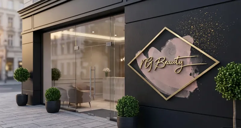
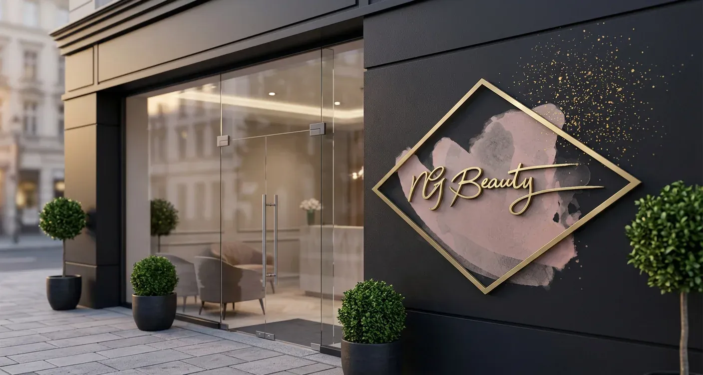
NG Beauty
Beauty studio
For NG Beauty, we developed a logo combining fine handwritten typography with a geometric frame.
Soft gradients and gold accents complement the lettering. The logo is designed for the façade, signs and studio as well as for digital channels.
Focus
- Handwritten typography with a geometric frame
- Soft gradients and gold accents
- Designed for façade, signs and studio
- Usable in digital channels
Logo
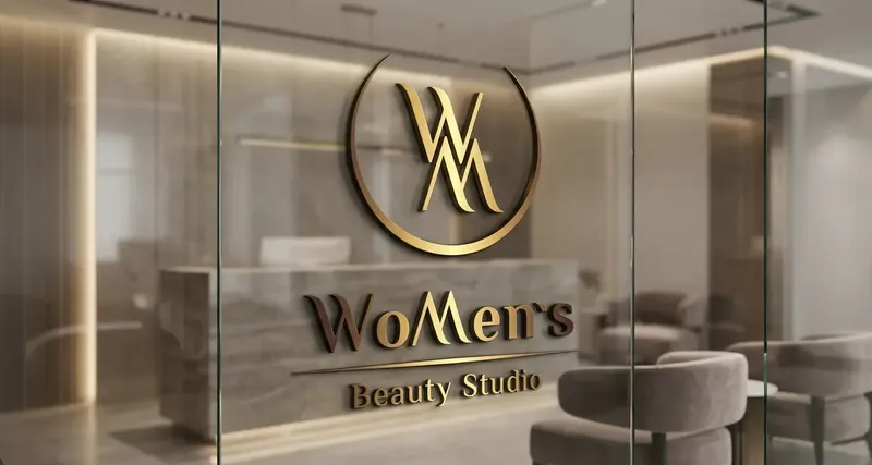
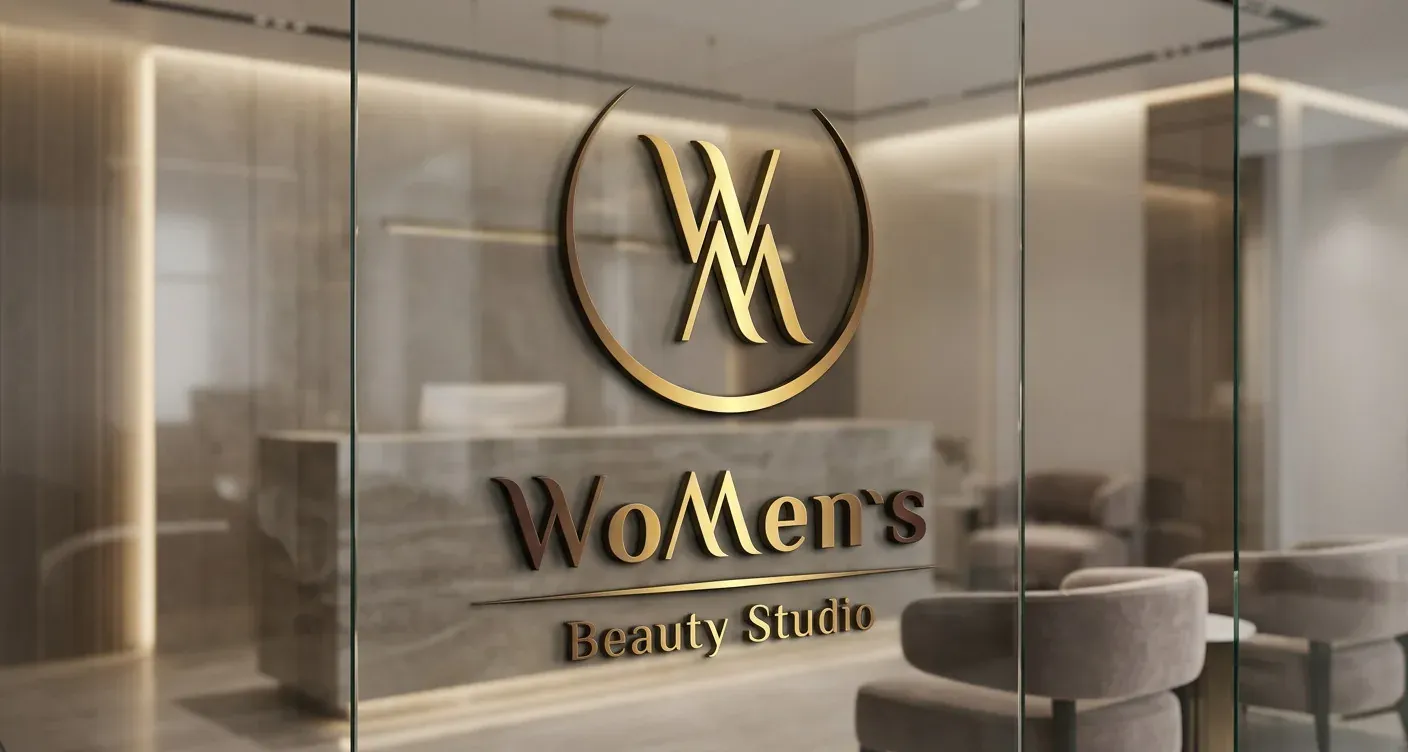
WoMen’s Beauty Studio
Beauty and cosmetics studio
For WoMen’s Beauty Studio, we developed a logo whose central element is a monogram of the initials “W” and “M”.
It is complemented by a simple typeface and gold gradients on a dark background – usable in print and digital media.
Focus
- Custom monogram logo
- Gold-on-black colour scheme
- Clear, timeless typography
- Usable in print and digital media
Logo
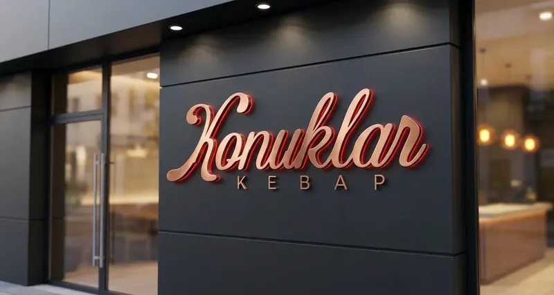
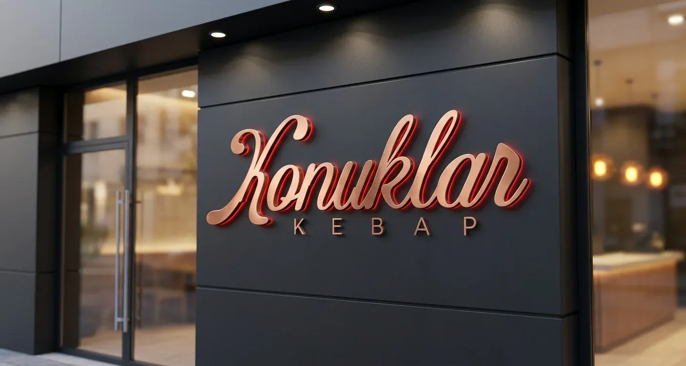
Konuklar Kebap
Restaurant
For Konuklar Kebap, we designed a logo with flowing lettering. The addition “Kebap” immediately identifies the business as a restaurant.
Colours and a clear form are designed for illuminated signs and the façade.
Focus
- Wordmark with the addition “Kebap”
- Flowing lettering as the defining design element
- Designed for outdoor advertising and illuminated signs
- Usable in print and digital media
Logo
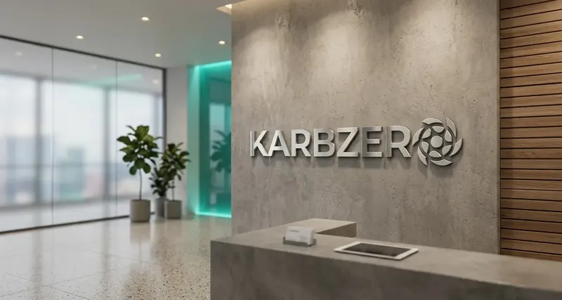
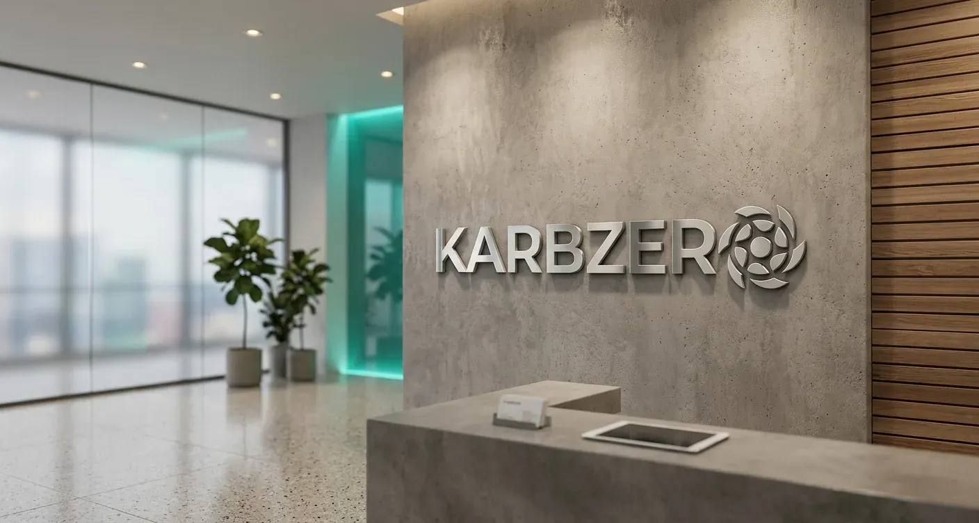
Karbzero
Brand with a technology and sustainability focus
For Karbzero, we developed a logo from a minimalist, bold typeface and a symbol that reflects movement and circularity.
The colour scheme is designed for both digital and physical applications.
Focus
- Clear, memorable logo
- Minimalist typography
- Dynamic symbol
- Usable in digital and physical applications
Projects
More projects
Contact
Planning something similar?
Need a logo or a visual identity? Tell us about your business – we will get back to you with an initial assessment.
Discuss your project